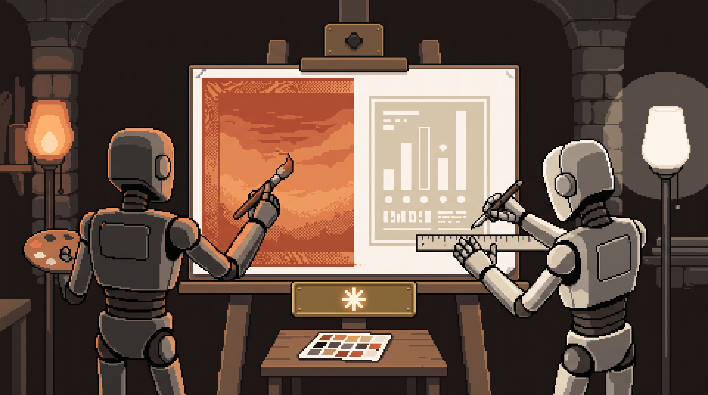
Ask an image generator for "an infographic about coffee consumption" and you'll get something gorgeous — with numbers that look like they were typed during an earthquake. Twelve percent rendered as "12o%," a pie chart that doesn't close, axis labels drifting off their axes. The art is stunning; the data is a hallucination you can see.
Ask a code assistant for the same infographic and you'll get perfectly accurate numbers — typeset in something with all the visual warmth of a tax form.
The mistake in both cases is asking one tool to do both jobs. Beautiful-but-wrong and accurate-but-bead are the failure modes of using diffusion where code belongs, and code where art belongs. The professional answer is a hybrid: diffusion for the vibe, code for the truth. This is also, not coincidentally, exactly how the graphics on this blog get made — generated hero art for the palette and mood, a code-rendered layer for every word and number you're reading now.
Create high-quality AI infographics with a hybrid workflow: use an image generator (Midjourney, DALL-E class) for backgrounds, textures, and atmosphere, and an LLM writing HTML/CSS for the layout, charts, and text. First have the AI extract a design system from reference images — named colors, fonts, spacing rules — so every graphic shares one identity. Then generate the art layer with empty zones for data, and overlay the information in code. Text stays legible, numbers stay correct, and "update the numbers for next month" becomes a one-line edit instead of a regenerate-and-pray.
Why the Two Tools Split the Job
The failure modes aren't accidents — they're each tool's nature:
| Diffusion (image models) | Code (LLM + HTML/CSS) | |
|---|---|---|
| Great at | atmosphere, texture, style, mood | exact text, real numbers, alignment |
| Fails at | rendering text, precise data | looking like anything other than a document |
| Editing | regenerate and pray | change one line, re-render |
| Right role | the wrapper, the background, the brand | the information layer |
Visuals are why people stop scrolling; accuracy is why they trust you. Each layer needs the tool built for it.
Step 1: Extract a Design System First
The step everyone skips, and the one that makes output look professional instead of random: before making any single graphic, build the system.
Gather 3–5 reference images with the look you want (Pinterest, Dribbble, or your own past work), hand them to a vision-capable model, and ask:
Extract the design system from these references:
- color palette: name each role (background, surface, text,
  accent, muted) with hex values
- typography: heading and body choices, weight rules
- spacing and borders: card radius, padding rhythm,
  border style
Output as a JSON design-tokens file I can reuse.
{
  "tokens": {
    "background": "#1e1714",
    "surface": "#292524",
    "text": "#faf5ef",
    "accent": "#e8935a",
    "muted": "#a8a29e",
    "font_heading": "display-serif",
    "font_body": "grotesque",
    "card_radius": "12px",
    "spacing_unit": "8px"
  }
}
Now "make an infographic" means "make an infographic in this system" — and the tenth graphic still matches the first. This is the difference between a brand and a folder of pictures.
Step 2: Bake the System Into a Reusable Instruction
Turn the tokens into a standing prompt (a skill, a project instruction, or just a saved snippet) so every future graphic starts pre-branded:
Infographic builder v1:
- Always use the attached design tokens.
- Layout: header band, 3-5 stat cards, one chart block, footer.
- Text minimum 24px equivalent; never distort or rotate data text.
- Charts from real values only; if a number is missing, ask.
- Output as standalone HTML/CSS, 1200px wide.
From here, producing a new graphic is: paste the data, get the code, render. Seconds, not evenings — and identical visual DNA every time.
Step 3: The Hybrid Assembly
The two-layer technique, concretely:
Layer 1 — the art (diffusion). Generate the background with explicit negative space: "background artwork, dark charcoal tones with ember accents, leave the central 70% as clean negative space for text and data, no text, no numbers." The no-text constraint matters — you're commissioning wallpaper, not information.
Layer 2 — the data (code). Bring that background into your code layer as the canvas:
<div class="canvas" style="background: url('art-layer.png')">
  <h1>Lead Response Time by Channel</h1>
  <div class="stat-card">…email: 4h…</div>
  <div class="stat-card">…phone: 12m…</div>
  <div class="chart"><!-- SVG bars, real values --></div>
</div>
Every number, label, and chart is real DOM — legible at any size, screen-reader-accessible, and editable by changing a variable. The art carries the mood; the code carries the facts. Neither hallucinates the other's job.
Why Code-Based Beats Flat Images Operationally
The output-is-code choice pays off weekly:
- Update friction dies. "Change Q3 to Q4 and swap the accent color" is a two-line edit and re-render — versus regenerating an image and re-proofreading every number it dreamed
- Consistency compounds. The tokens file keeps a 40-graphic series coherent, which is what makes a feed look like a publication
- Precision survives scaling. Text rendered by a layout engine is crisp at every resolution; text rendered by a diffusion model degrades the moment you crop it
- The pipeline automates. Code + tokens + data means a script can generate the monthly metrics graphic with no human in the loop
That last point is the quiet endgame: once your graphic is HTML driven by data, it's one step from being generated — data lands, the graphic appears. (The same architecture, with a video renderer, is how this blog's explainer graphics get produced: generated hero art defines the palette, and a coded composition renders every headline you see.)
A Worked Mini-Example
The full loop, start to finish:
1. references (3 images) -> model -> tokens.json        [5 min]
2. art layer: "dark background, central negative
   space, no text" -> background.png                    [2 min]
3. data + tokens + builder prompt -> infographic.html   [3 min]
4. render html -> png at 2x                             [1 min]
5. next month: update 6 numbers in the data, re-render  [1 min]
Step 5 is the whole argument. The first graphic costs an evening; the fortieth costs a minute, still on-brand, still accurate.
Frequently Asked Questions
Why not just use an image generator for the whole thing?
Because text and numbers are where diffusion models hallucinate in pixels — mushy labels, wrong digits, charts that don't close. Fine for atmosphere; disqualifying for data. Generate the wrapper, code the information.
What exactly is an HTML infographic?
A graphic built as web code rather than a flat image. Text stays sharp at any scale, colors change via one variable, charts bind to real values, and updates are edits instead of regenerations. Render it to PNG when you need a shareable file.
How do I keep branding consistent across many graphics?
Extract a design system once — named colors, fonts, spacing as tokens — and reference it in every generation. Consistency comes from the system, not from remembering what last month's graphic looked like.
Which model should I use for each layer?
Any strong image model for the art layer, and any strong coding model for the layout. The workflow matters more than the brand of tool — the design system and the two-layer split are what produce the result.
Wrap-Up
Art and accuracy stopped being a trade-off the moment we let each tool do its half: diffusion for the atmosphere that stops the scroll, code for the information that earns the trust, and a design system holding the two together across every graphic you ship. Extract the tokens once, bake them into a builder instruction, commission your backgrounds text-free, and overlay the truth in HTML. The first one takes an evening. Every one after takes a minute.
Related posts
One Channel, Done Well: Finding Where Your Audience Actually Lives
Stop splitting your energy across five platforms. A scorecard for finding the one channel where your audience actually lives.
The 100% AI Handoff: My Start-to-Finish Content Strategy (Every Prompt Included)
I stopped producing content and started owning it. The full pipeline that researches, writes, illustrates, publishes, distributes, and films every post — with every prompt ready to copy.
Build an AI Social Media Content Pipeline: Coach, Writer, Grader, Scheduler
Stop hand-posting every day. A brand brief, five focused AI skills, a grading rubric, and a scheduler turn one idea into a week of platform-tailored, quality-checked posts.